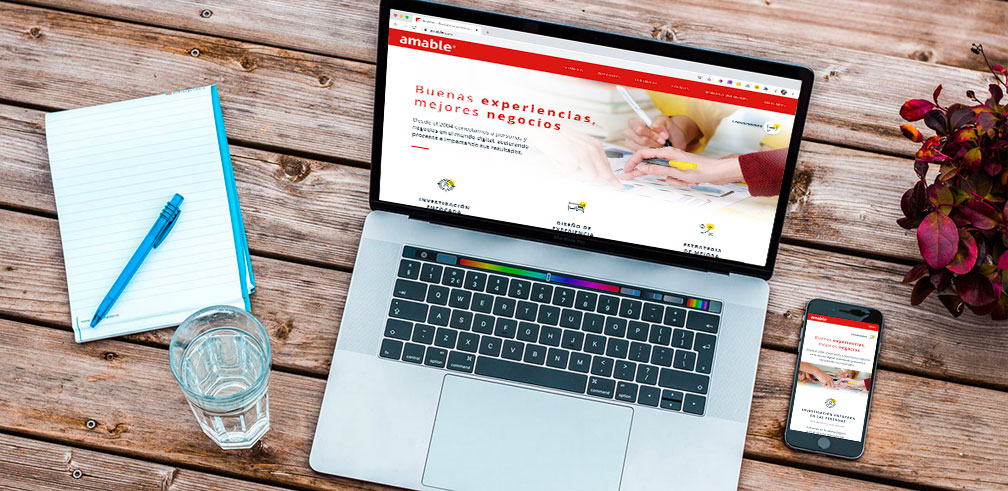
Complete Website Redesign
The company's website consolidates information about their services, added value and team members in a simple one-page format but it could improve the information distribution along with new relevant content.
Problem to solve
In the COVID-19 pandemic context it was decided to update and improve the digital channels of the company, being one of them the website. For that purpose this challenge was approached as a user experience improvement project by covering the understanding, definition, prototype and validation stages.
We face two different profiles of stakeholders, on one hand we have the focus on trajectory of the company and the team capabilities, while in the other the necessity for design a information flow to enhance the conversion of visitors into potential clients.
How might we design a solution for these two points of view? How can we align the stakeholders in their own visions for the website? How can we help to the visitors to learn from the company history while facilitate contact?
Solution process
Different teams were assigned to tackle every front of the digital communication, from fundamental aspects like reviewing the company’s values and what we want to transmit through the website, as far as new visual and branding guidelines for the entire strategy.
At the same time analizar and define the public target and the different personas that could visit the website and what information is key for them. Three (03) types of proto-personas were defined:
- Company’s persona
- Current client
- New client
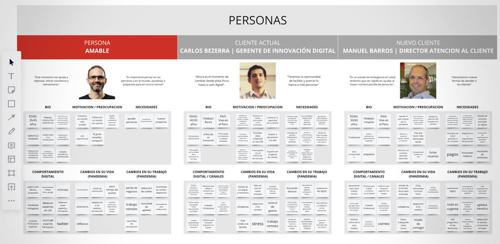
Proto-personas design
A co-creation workshop with partners, managers and the founder of the company was prepared to gather inputs and align the vision and communication to be used in the website as well as in the most efficient contact channels.
Through the use of a digital board and post-its we manage to collect all the main ideas, suggestions and concerns of the stakeholders, spark the discussion about the purpose for the website as a digital asset and finally get alignment for the goals to achieve and the way we bring solution to the redesign challenge.
We organized and cluster that information to make sense for a new information architecture that was the base for the website interface.
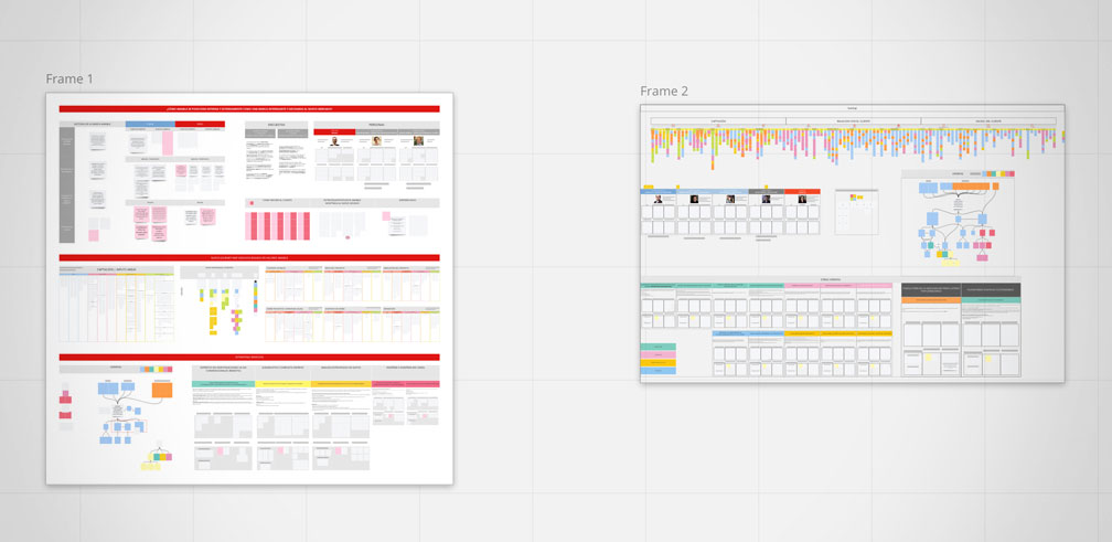
Stakeholders’ co-creation workshop session
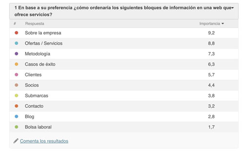
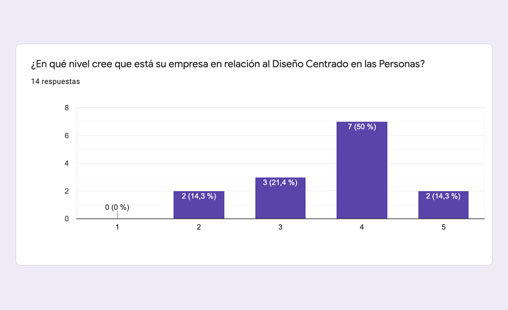
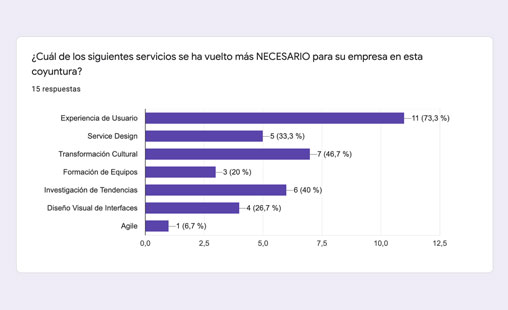
Then, through some surveys, meetings and in-depth interviews we move to collect information of every profile to validate their expectations and what information they considered valued for the new website.
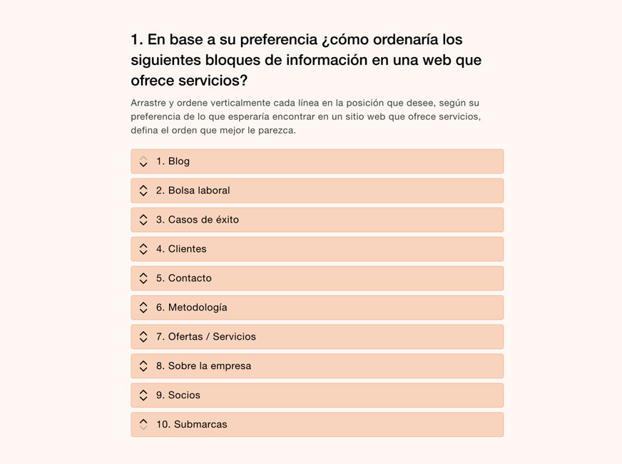
Prioritization survey
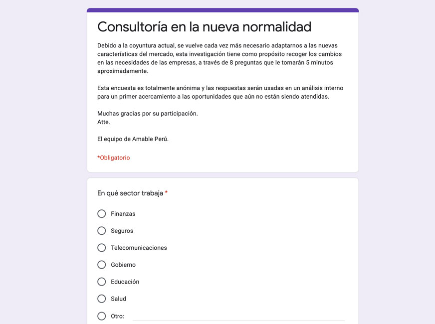
Value proposal survey
Design proposals
The interface proposals were designed with wireframes and prototypes to share and validate with partners. After some iteration sessions for layout and content alignments the final prototype was achieved in which the new brand guidelines were applied in different options until the final interface.
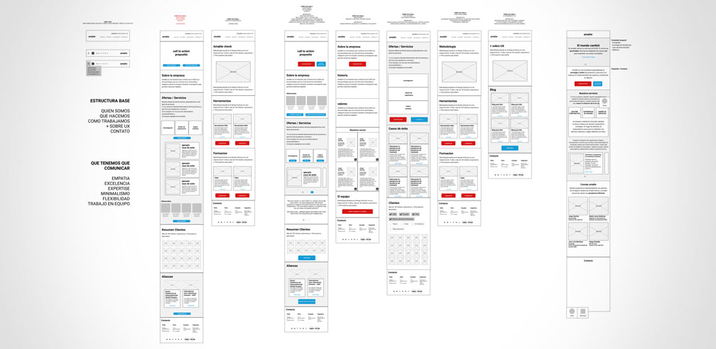
Interface proposal at wireframe level
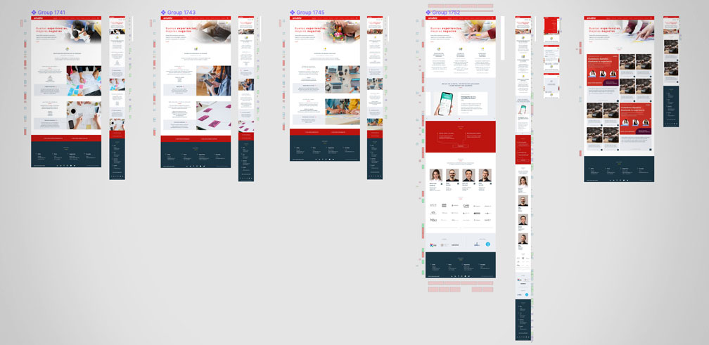
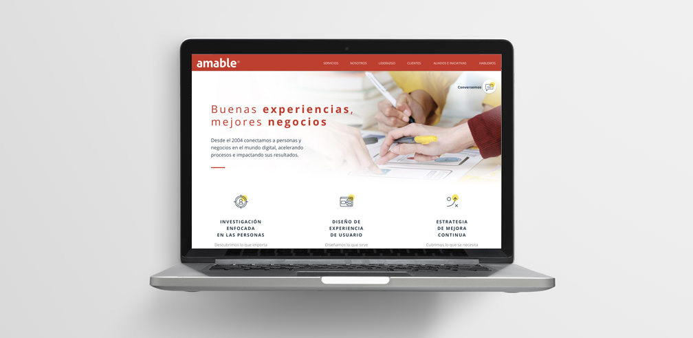
Final visual interface
My role
- I was in charge of the initial information architecture scheme for the website which was iterated based on the users’ research and partners sessions.
- Helped in the interface definition process with the visual design team applying the new visual guidelines and the company’s values that wished to transmit in the website.
- Functional prototype development on Figma for both desktop and mobile interfaces in order to validate with users and stakeholders.
- Different content management system platforms analysis to evaluate which one should be used among which were: Wix, Webflow, Squarespace and Wordpress.
- Finally, I was in charge of building the HTML templates for the integration in a Wordpress’ custom theme.
Learnings
Balancing expectations of different stakeholders in a design project is always challenging. This project had to work on the alignment of the value proposition, communication and visual support to redesign the website as part of a more complete strategy in a context where the digital assets became a fundamental piece more than ever.
