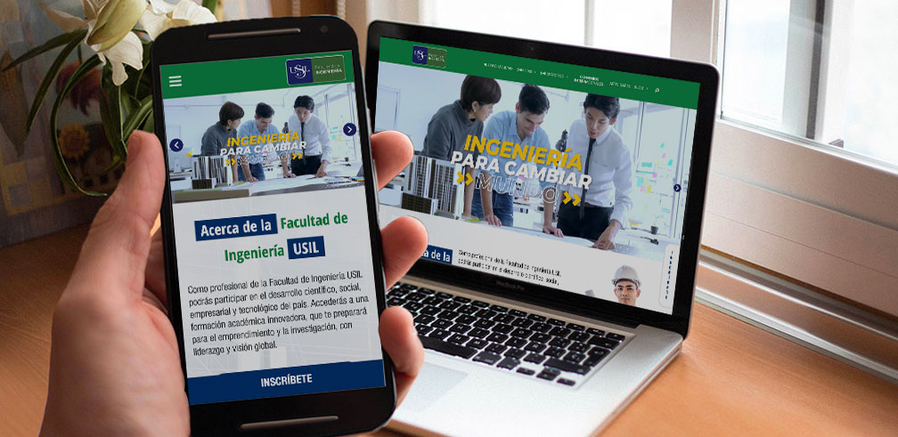
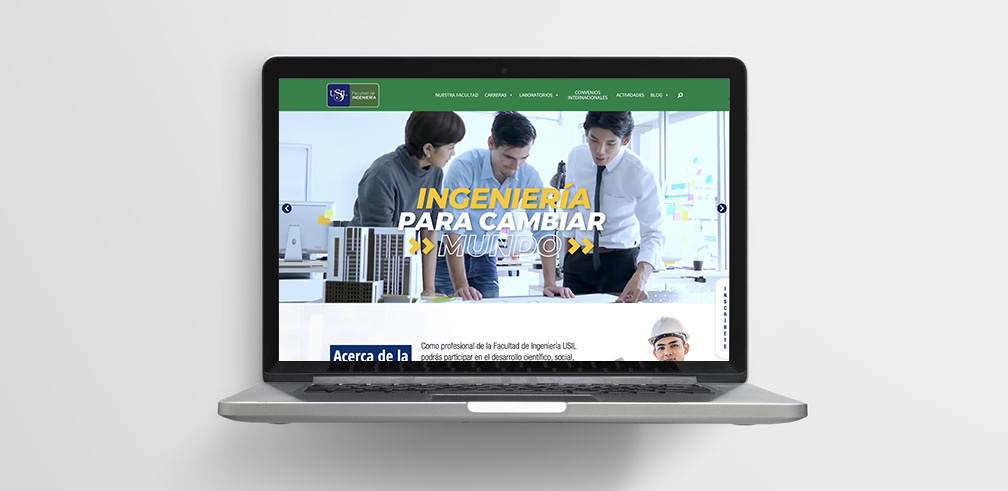
Analysis and Design a fully Functional Prototype
The engineering faculty lacked their own digital assets that allowed them to show the faculty’s advantages and unique characteristics. At that moment only dispose of a section in the main website of the university along with the other faculties, despite the customization, this space was limited and did not allow to engage the public target in the best way.
Problem to solve
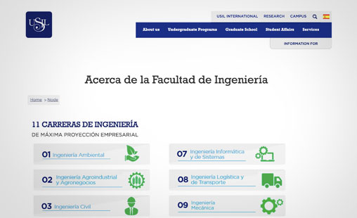
Designing from scratch a web portal that holds both academic and commercial information in an organized and accessible way. Becoming it into a content hub where other digital campaigns of positioning could come off.
Previous single-page without navigation
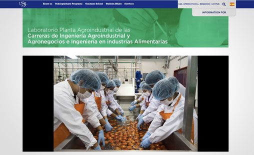
Unorganized information of the laboratories
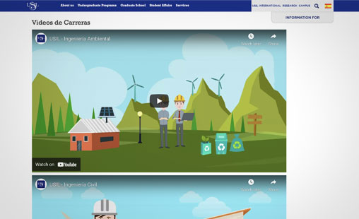
A lot of embedded videos with no context
Solution process
To approach this case a target user research strategy was made with the goal of identifying pre-existing needs and behaviors that allow us to design an interface that helps the users and be useful for the faculty.
In-depth interviews
Three different user profiles were identified: the current students, the potential students and the parents. All were part of interview sessions individually to listen to them, understand their information needs and identify innovation opportunities.
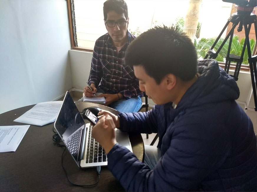
Understand the current situation
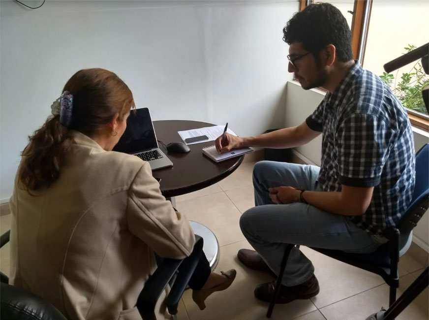
Identify behavior patterns and pain points
User persona design
After the approach with the different profiles and with the faculty coordination three personas were chosen to be at the center of the design process:
- The ambientalist, Ana
- The gamer, Gabriel
- The teacher, Marcela
Each of them represented different characteristics and needs. It was key to have in mind these personas while designing the navigation and interactions for the interface.
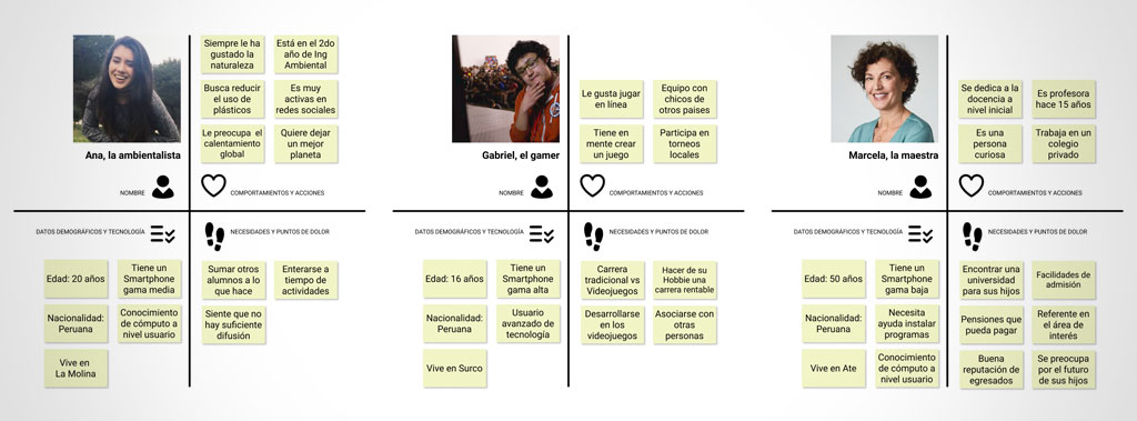
Goals, behaviors, needs and pain points
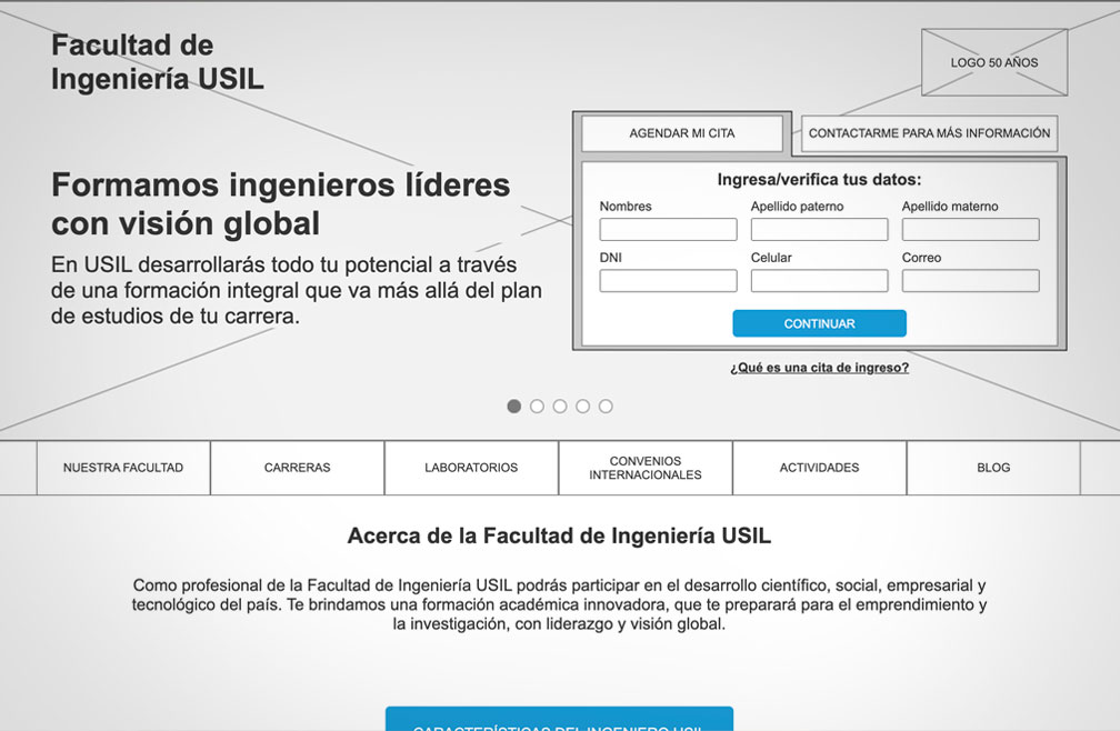
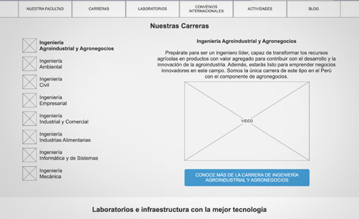
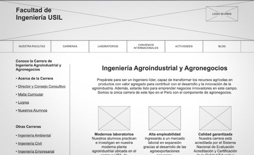
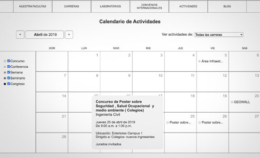
Wireframe and prototyping
A low fidelity but high-detailed navigation, component and real information wireframe was built. It was important to know which type of content was more efficient for the different needs of our personas.
Usability tests were conducted with the prototype and real users, young and older people that tested the interface. This allowed us to validate a lot of elements, identify death-ends paths in the navigation and improvements for the new design.
My role
During the project I was in charge of:
- Elaborating and facilitating a workshop with the academic representatives to understand their needs and goals.
- Working side by side with the commercial team to collect all the information and define the visual guidelines.
- Defining the participants profile for the interviews and usability tests.
- Designing, moderating and conducting all the sessions with real users.
- Built the wireframe and prototype and all its iterations along the project.
- Presenting the progress to the stakeholders and ensuring the project scope and roadmap.
Learnings
Coordinating work with different areas of a company could be challenging at first. It is crucial to understand the different needs of each area by identifying common goals, how their interactions are and finally, what they want to accomplish.
It is key to maintain an open communication channel with the stakeholders in order to align expectations and ensure the flow of the project.
Always we assume that “people don’t read”, and generally it is true, but there are some cases and motivations where the user needs to understand and to be well-informed in order to make a decision. A well-designed interface facilitates this to benefit both its users and the business’ goals.