UX Redesign for Controlling and Managing Platform
One of the biggest companies of the concrete distribution industry developed years ago a platform for deliveries monitoring and managing. As a market leader, they look to optimize its interface to bring this tool closer to their users, such as: engineers, managers and site managers.
To achieve this, expert analysis and in-depth interviews over the interface were made with different users’ groups to define the best experience.
The challenge and my role in the process
The main challenge was to define a platform that responds to the particular needs of each profile. Optimizing the time of use and the learning curve by making it intuitive and evident.
Profile analyses were made for each type of user and its needs in order to determine key processes on the interface and how to optimize those interactions, because by the type of business, the time was a key factor for the requests and delivery queue. I was actively involved in the interface analysis, research, ideation and test stages.
Pain points on the current interface
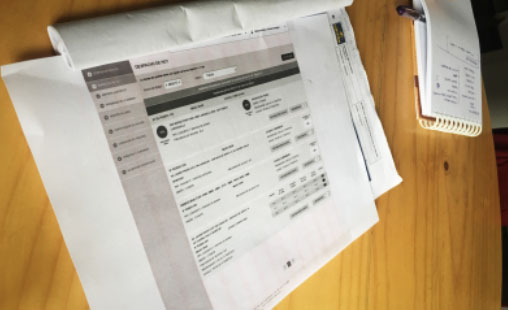
Some actions and components on the interface that confused the users were questioned.
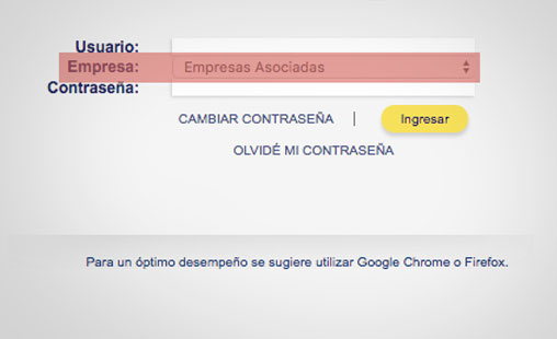
Choose company
Why show to the user a field which is not going to interact in most cases?
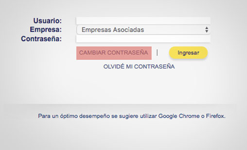
Change password
Why does the interface allow the users to change password before logged in?
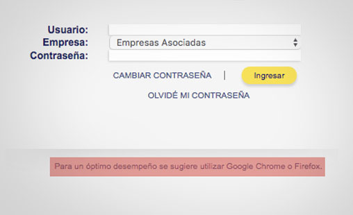
Browser use
It is not the responsibility of the user to assure the optimal performance of the platform.
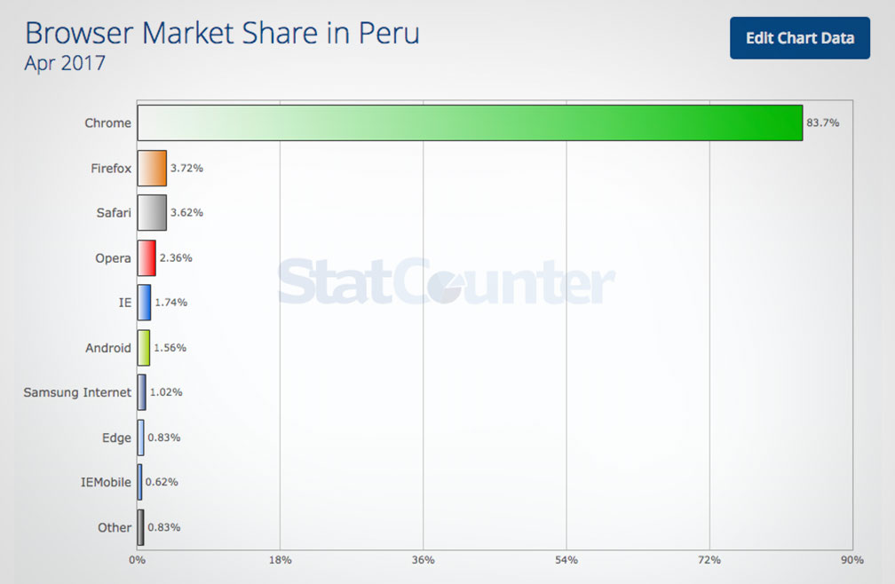
The information well-applied allows us to reduce the users’ cognitive load. If we know in advance which browser is the most used, the platform should be optimized to that browser. 84% of people use Google Chrome in Peru and the second browser had less than 4% of use penetration.
You don’t have to be a guru to realize the text of “optimal performance” was unnecessary.
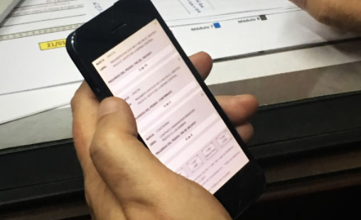
Reduce the interactions on the interface
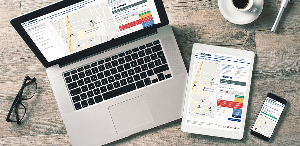
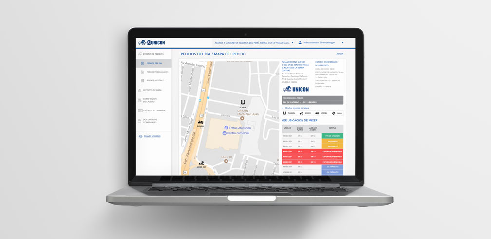
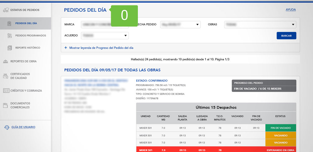
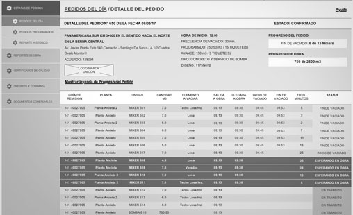
According to the platform visits internal report, the most used module is the orders’ status.
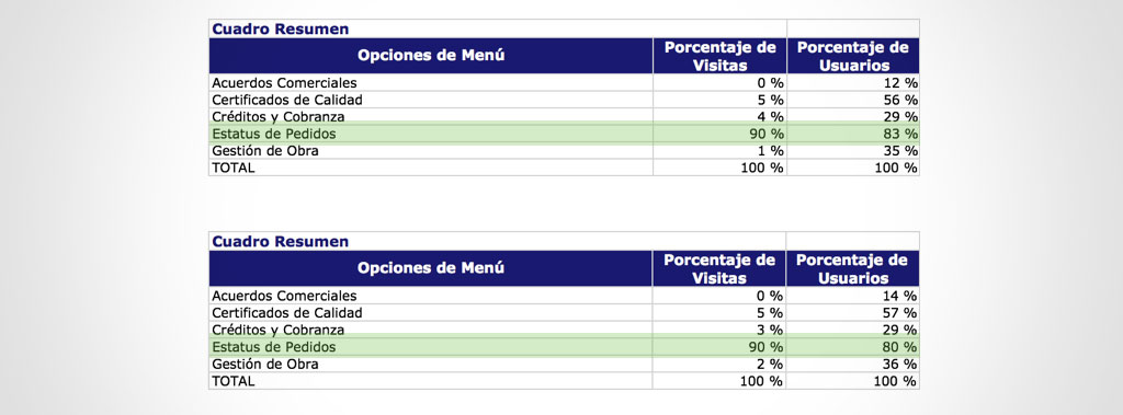
In both reports the orders’ status module had 90% visits and over 80% unique users.
How many interactions (clics) are necessary to access this information?
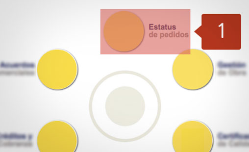
One
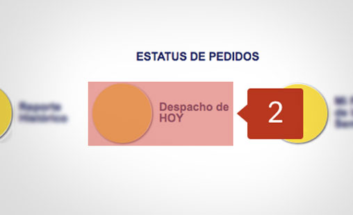
Two
Three
Without the log-in steps, as we show before, that process had distracting and confusing elements that increased the amount of user’s interactions (clics) to reach the most consulted information.
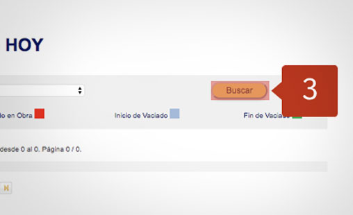
Our proposal
None
Once again the well-applied data interpretation allow us a better decision-making for the interface functionality and facilitates the navigation for the users.
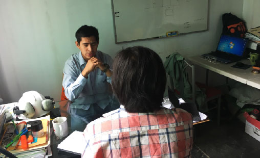
In-depth interviews with users
Not all was quantitative data analysis, the design is supported by what numbers told us but also has to take in count the opinion of its users. We put the users at the center of the project. That way we look to contrast and balance the information obtained from the reports with real users’ incidences and experience for the purpose of pulling out insights that allows the interface to show information and respond in an expected way.


This platform is the 30% of the company, the other 70% is the concrete. If all the orders were made there, people wouldn't be able to communicate because the current platform won’t resist the traffic load.
It was evident the users’ need to have a tool that helped them in their daily management and brought them the necessary information in real time.
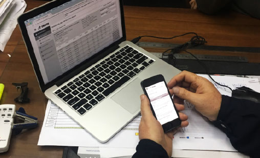
Ideation and functional prototyping
Wireframes and prototypes were built for both desktop and mobile devices, the goal was to test in the shortest possible time the findings and recommendations gathered in the data analysis and user research.
User experience principles for the new platform
After the current situation evaluation and the interface goals definition, five principles were settled for the platform to accomplish always in favor of the users.
- Explicit over implicit
- Clear interactions and common language at the whole interface.
- Perishable product
- The waiting time on the field (WTF) it’s a critical factor. The interface should notify the user at every stage.
- Multi-Brand
- The platform should show the two brands and allow monitoring any from the same interface.
- Responsive
- According to the different user’s needs the platform must adapt for desktop and mobile devices.
- Clear and minimalist design
- The interface shouldn’t have any distracting elements. Every decision must be made maintaining the simplicity of use.
General conclusions
- The new design has been well received by the frequent users.
- Users without previous experience with the platform express that it is a very useful and time-saving tool.
- Quick navigation improvement between different sections.
- Substantial time-saving was accomplished by showing at start-page the order’s status module.