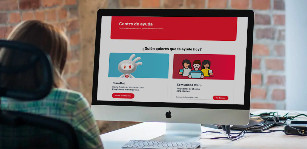
Case: Experience Redesign for Help Center Platform
One of the country's biggest telecommunications companies needs to rethink this section on their website. This is how we approach this challenge by understanding the reasons behind and focus on the benefits we want to give to the users.
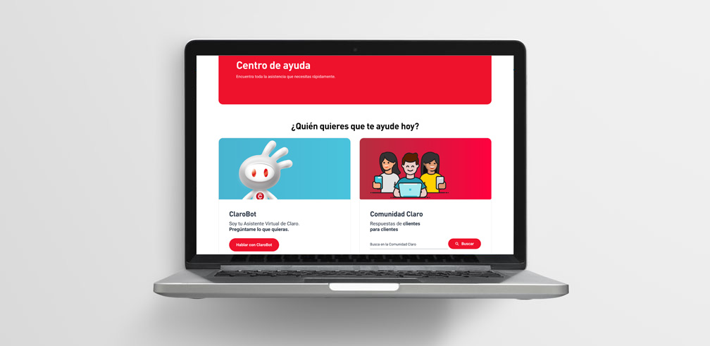
Problem to solve
The company had a license for an external helping platform that contains a big amount of information, also, part of this information had been replicated to other channels like a chatbot and help forum which generates duplicity and more maintenance costs, but at the same time, help our users to discover, understand and appraise the new client attention channels.
How might we take advantage of the existing channels of information? How can we understand the different users's needs and give them the best possible experience? How many types of customers there are and which ways to contact the prefer?
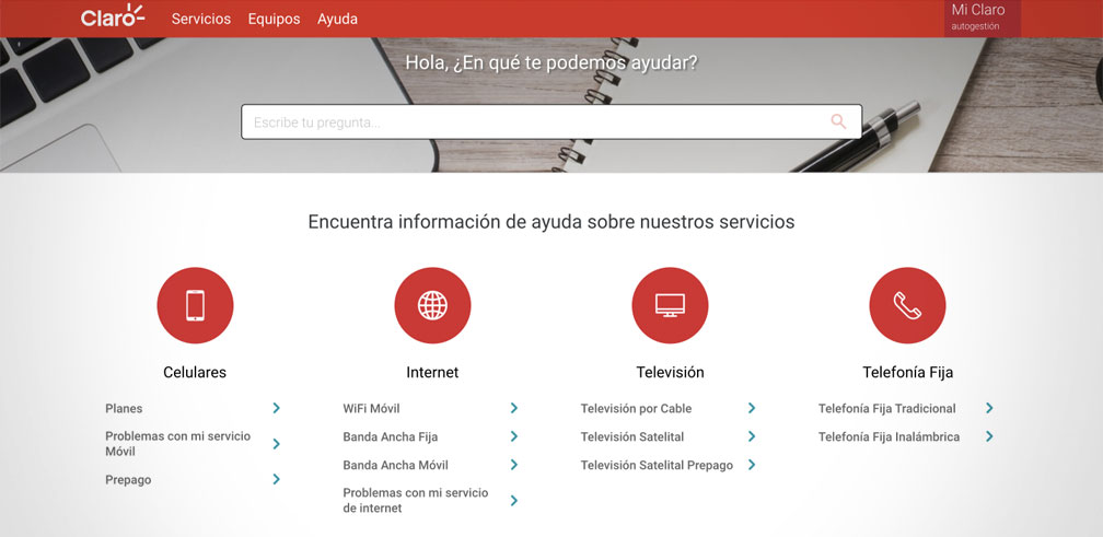
Previous help center platform
Solution process
We identified that the chatbot and the forum had more engagement with the users, this was aligned to the reinforcement strategy for direct digital channels and promote the self-attention of the clients.
Users that doesn't like to wait for an answer or browse in lots of help articles or post are more likely to use the chatbot by their immediately and real time response. While, users that doesn't like to chat or have preference to read real case post or experience prefer to use the forum and community.
With this in mind we proposed to migrate the whole content and stop paying for the platform license and prioritize the new digital channels.
The new section wireframe design started by defining the components and elements to communicate the new attention channels. Graphics and copywriting proposals had been worked on in order for both channels to live together in the interface, highlight their benefits and bring quick access to the main clients' questions.
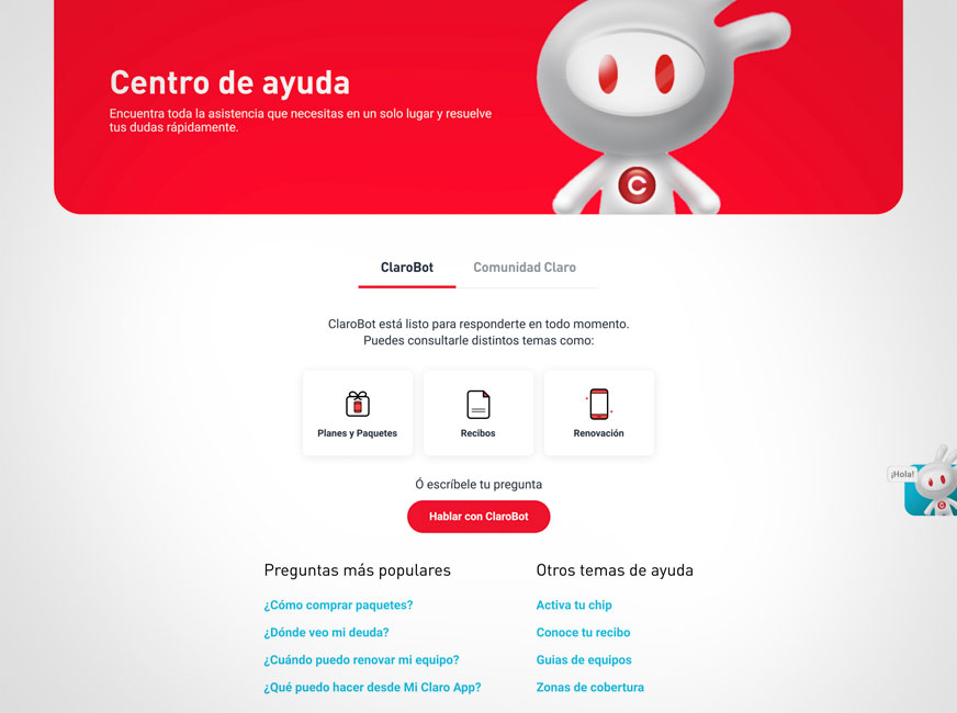
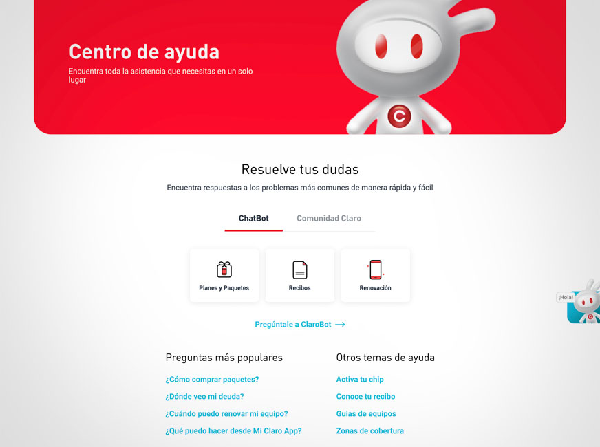
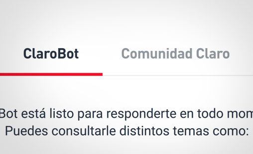
Tabs to select the attention channel
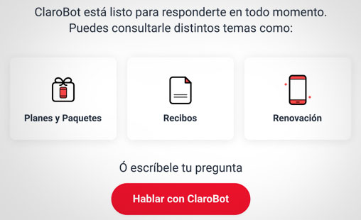
Highlighted blocks for help categories
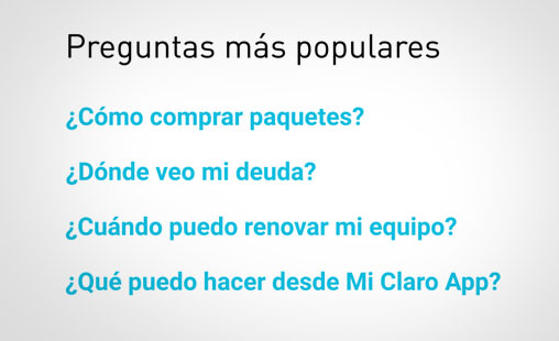
Quick access links
In addition users profiles were defined to conduct user tests for the interface proposal to validate it in real interactions and navigation. To do that a fully functional prototype of the website homepage and navigation was built with the new help center section.
Design proposals
Different options were built with the goal of offering a pain-free transition for the users along with showing the main information at hand by avoiding unnecessary clicks.
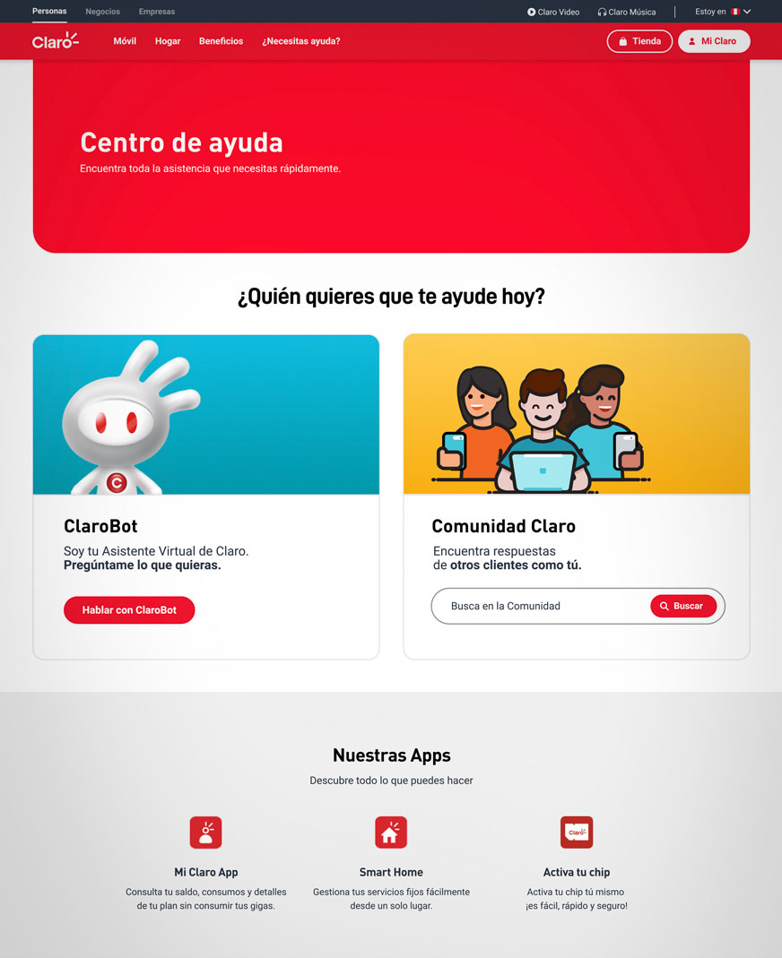
First proposal
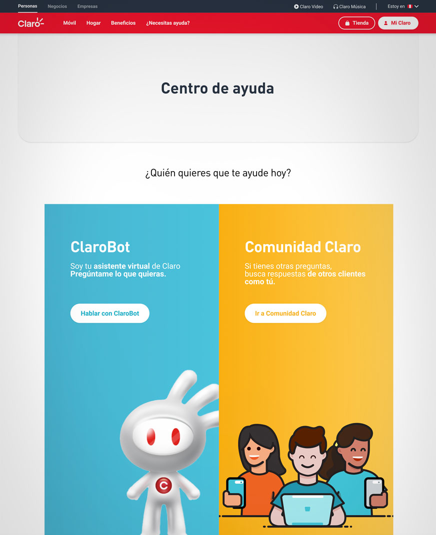
Second proposal
After the iterations with the client a functional prototype was prepared that simulates the navigation of the actual website of the company with the link to the new help center section to measure how intuitive it was for the users to find it and once there how they interact with the interface and the information shown.
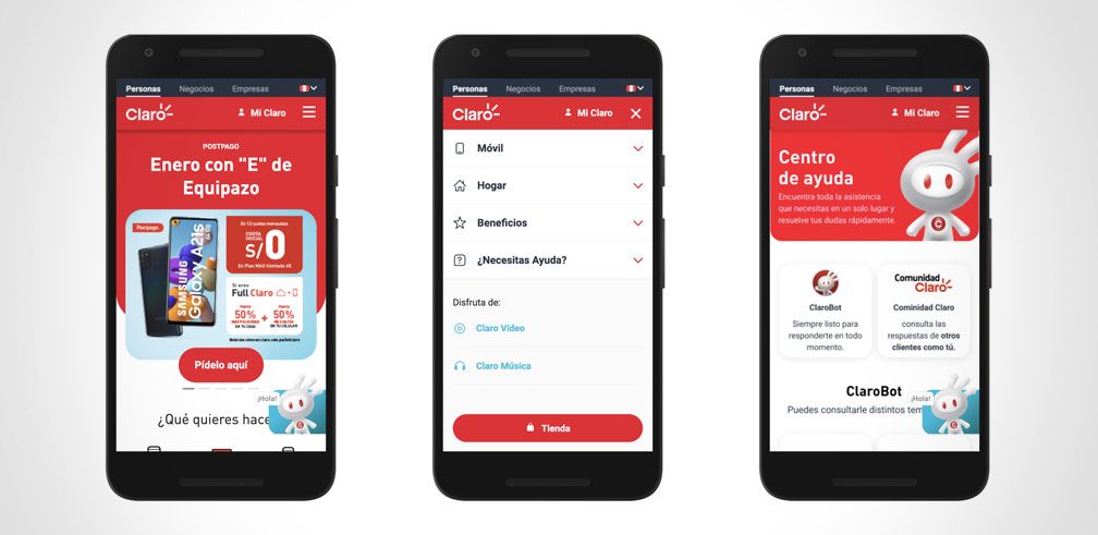
Mobile device’s functional prototype
Improvements were made based on the user tests and the final interface was delivered to the development team for its construction and publication on the public website.
My role
I was in charge of the initial wireframes and the iterations after the presentation to the client and the user tests feedback.
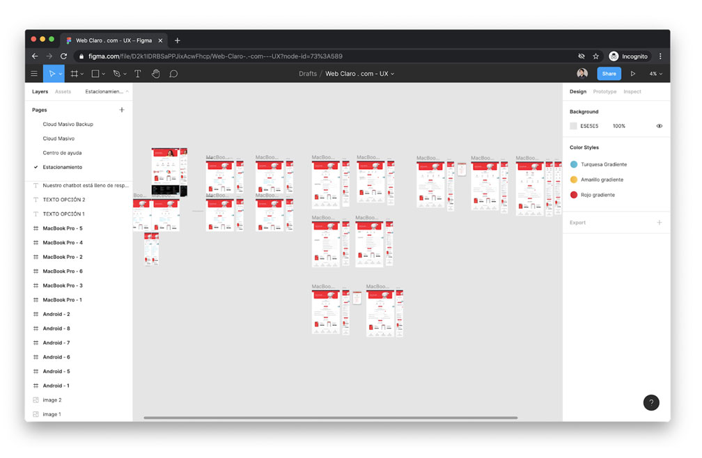
Wireframes design in high fidelity
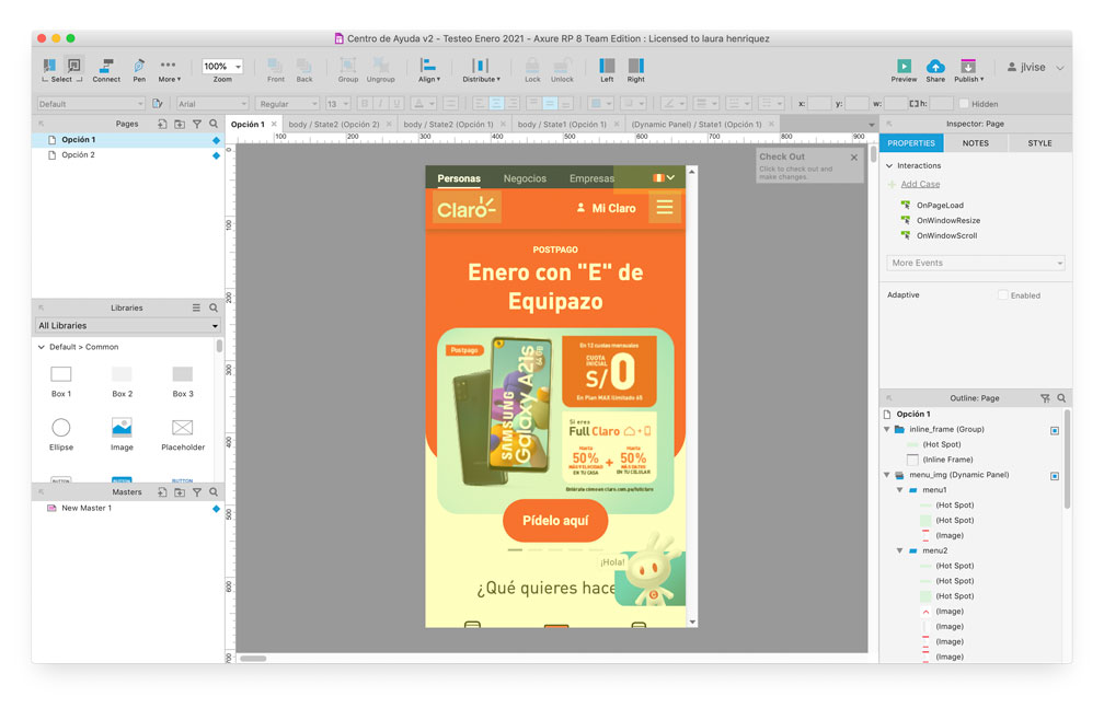
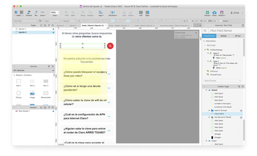
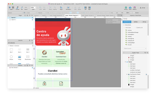
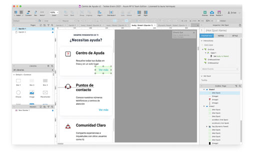
I built the functional prototype by using Axure RP which is a very flexible but complex software that allows implementing navigation elements, logics and conditionals that respond to the user interactions.
I conducted remote usability tests with Zoom and Lookback tools that enable us to record the users' interactions and have at the same time a private room for the sessions client’s supervision in real time.
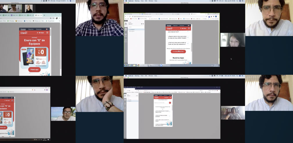
Remote usability tests with users
Finally, I helped the visual design team for the final mobile interface and adapted them for the desktop version by applying the components and guidelines of the client’s design system.
Learnings
The business needs alignment process becomes easier when the decision makers have a full understanding of the data and statistics that supports an hypothesis. In this case to cease a platform license and maximize new digital channels.
The users value to save time while navigating an Interface by allowing them to generate shortcuts and have relevant information at hand. This reduces the discovery, learning and adaptation process.
The interface validation with real users always brings a fresh view for the design and users’ actions and how they expect an interface that is unknown for them responds and communicates relevant information.
