Case: Website Customer Experience Uplift
A company with more than 65 years of presence in the US, improving lives through innovation, needs a major upgrade for their main corporate website. This upgrade should facilitate visitors' ability to reach and find the information they need without getting lost in hundreds of product pages.
Problem to solve
The rapid growth of the product catalog and solutions for many industries has led to a chaotic flow within the company's website due to the lack of an organized information architecture. Numerous product pages overwhelm visitors and drive them to abandon the website, resulting in several lost opportunities.
How might we design an interface that allows users to find what they need? How can we facilitate access to relevant information? How can we organize the current pages to make them more accessible?
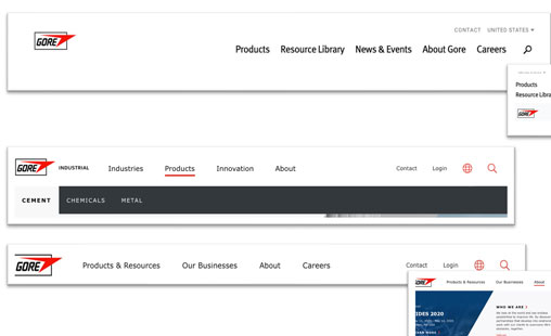
Previous single-level main navigation
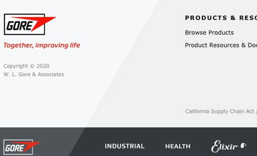
Footer for basic information
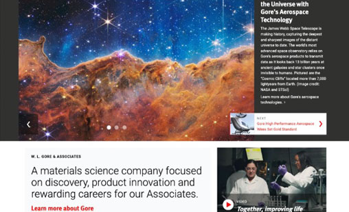
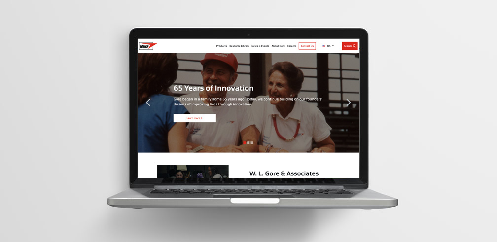
Crowded Homepage with lot of text
Solution process
Due to the short timeframe, we had to efficiently collect relevant information for all areas of improvement. Splitting the task by section of the website was key to maximizing time and effort, and ensuring the goal of redesigning the experience.
We gathered internal information about the current visitor experience on the website from analytics reports and interviews. Additionally, we looked at competitors and referents from other industries in a tailored benchmarking process. A meticulous expert review was conducted on the critical areas of the website to define the necessary structural enhancements and quick wins.
Benchmarking
In the benchmarking process, we looked at competitors as well as websites from other industries that manage a large number of products and use megamenus for quick access to information and segmentation. We also examined content strategies that we can apply to boost the user experience.
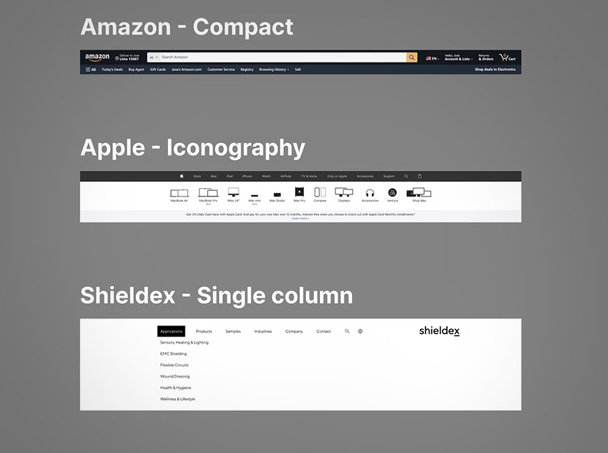
Other industries header benckmark
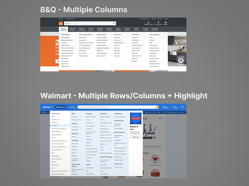
Megamenu benchmarking & Content strategies
Wireframing
After collecting all the information, design wireframes were created to validate the new components and the structure for the homepage and navigation. This process allowed us to check with stakeholders and complete the defined milestones of the project, thus avoiding rework
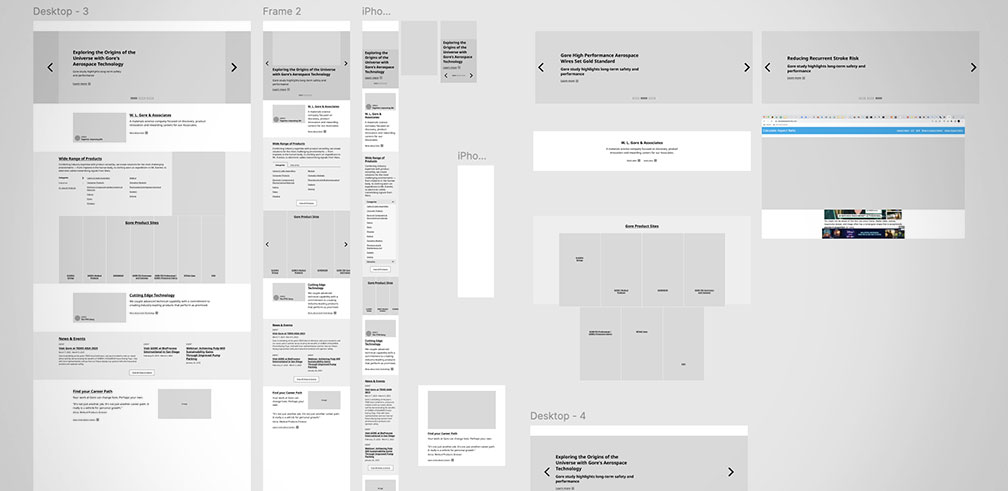
Homepage desktop & Mobile wireframes
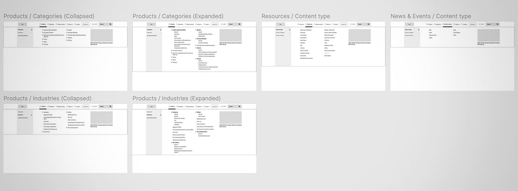
Desktop main navigation megamenu wireframe
Prototiping
As part of the design process, we prototyped several areas to provide a clear vision of their functionality and interaction. This iterative approach allowed us to align expectations effectively between stakeholders and the development team, reducing the potential for misunderstandings and ensuring a clear and shared understanding.
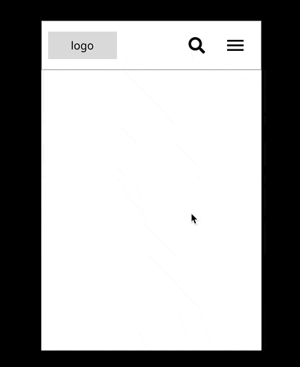
Three-level megamenu mobile

Dropdown for language selection
Learnings
As a designer, I always aim to put the user at the center of everything I do. In this project, the users were not only the visitors but also the business, which is an important mindset for growth.
It was an intense journey, but I am grateful to have achieved the goals defined at the beginning. Planning was crucial to delivering such significant improvements in a very short time.
Working with a great team of designers and developers was also key to our success. Additionally, the management team allowed us to work with ease and stay on track.
In the end, the client was delighted with the deliverables and the entire process. We involved them in the success through touchpoints along the way, which truly made a difference.